PROJECT:
Design a small-scale e-commerce site/blog for vintage and antique items.
TEAM:
I was the sole designer for this job. My designs were created on Figma and were then given to a front-end developer to implement.
CHALLENGES:
- Create an easy-to-understand e-commerce site for shoppers.
- Allow users to learn about the products for sale.
- Establish a brand as well as create a logo design.
RESEARCH:
I first researched large e-commerce sites such as Amazon, Ebay, and Etsy. However, in order to create a simple, small-scale e-commerce site I decided that I needed to look at sites that were geared towards selling vintage and antique items specifically. At this point I researched sites like Ruby Lane and Tara Shaw. After understanding the vintage/antique sale space as well as incorporating what the client wanted to provide users, I decided that the site would not only be a place to sell items, but also a blog to allow users to learn more about the item and how it was obtained.
SOLUTIONS:
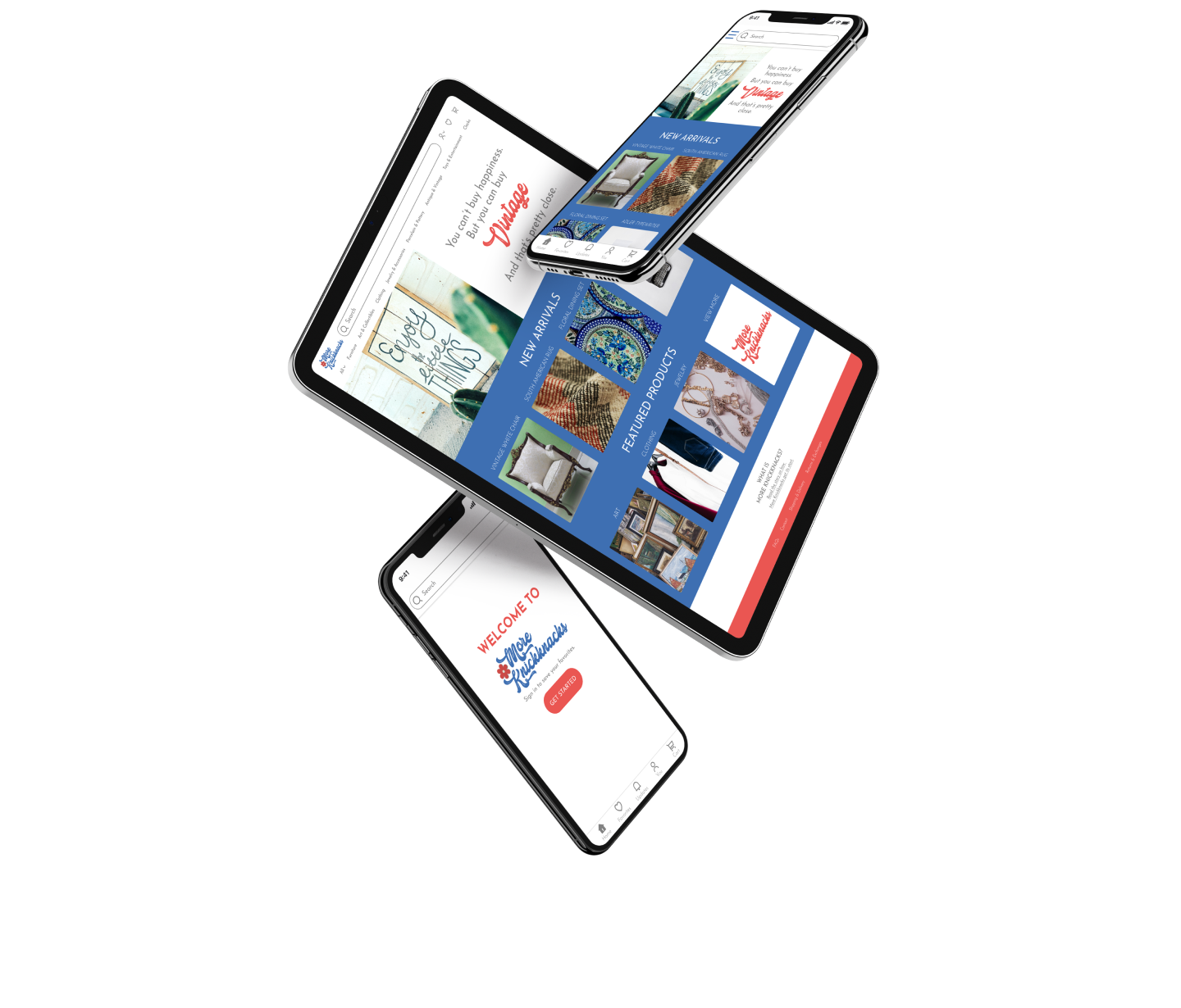
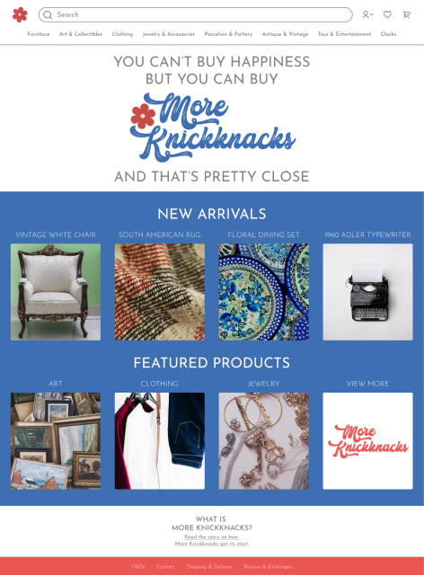
Challenge 1: Easy-to-understand E-Commerce Site
After my initial research, I had to determine what would give the user a simple and enjoyable approach to finding items. I decided that the homepage would be divided into two sections: ‘New Arrivals’ and ‘Featured Products’ sections.
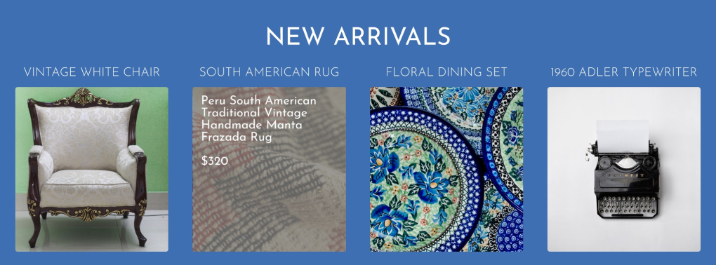
- The ‘New Arrivals’ section would feature any new items for sale. This would change regularly, keeping the user interested in returning to the site to see new items featured.
- ‘Featured Products’ would be categories of items the client wants to highglight for some time. Users can click on a category they are interested in and see all the products within that category.
Challenge 2: Quick Access to Information
I wanted the user to have access to information quickly without having to navigate through the site too much. I implemented an overlay on the items which will present the user with a quick overview of the product’s information on hover.
Challenge 3: Establish a Brand
The client tasked me with creating a logo and brand for their site. They provided me with a photo of a flower that inspired the name of the site as a guide for the brand of the site.
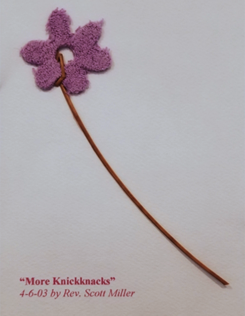
I created a flower using Adobe Illustrator and Adobe Photoshop. I decided to make the flower look like a paper cutout because I wanted it to look like a cherished item that was saved in scrapbook.
- The flower has a cardstock look with paper grains.
- There is a white edge on the rim of the flower to give the effect that it is a cutout.

When creating the logo, I wanted the font to look like an antique style font. I wanted the letters to be easy to read and would flow well with the flower design. The swash of the K serves as a stem for the flower to tie the logo together.
REFLECTIONS:
As my first job, the experience is priceless.
- I learned the importance of communicating the design process to clients in order to end up with a successful website. Fully clarifying my design process and maintaining communication throughout the project will result in satisfied clients, and less work as the project progresses.
- I thoroughly enjoyed the creative side of this job. Creating a logo in Adobe Illustrator and Adobe Photoshop was fun and allowed me to hone my personal creativity.
- Typography is a topic of continued interest and I was able to use my knowledge of typography to choose fonts that fit the look of the site.